7 Effective Ways to Increase Your Website Conversion Rate [With Examples]

What happens when people click on your website? Do they scroll through briefly without taking any action? If so, then you need to improve your website conversion rate.
While getting more traffic to your website is important, converting website visitors into customers is no small feat either.
In this article, we’ll talk about how you can increase your website conversation rate and turn more website visitors into paying customers.
TABLE OF CONTENTS
1. Conversion rate optimization: Definition
2. How can you measure the website conversion rate?
3. How to increase your website conversion rate: 7 practical tips with examples
Conversion rate optimization: What is it and why is it important?
Conversion rate optimization (CRO) is the process of increasing the percentage of website visitors who take the desired action. The desired action can be anything from subscribing to an email newsletter, purchasing a service or product, or filling out an online form.
Conversion optimization is important for various reasons:
- With conversion optimization, you’ll be able to maximize the traffic generated through digital marketing activities. In other words, you’ll get more leads.
- CRO helps to identify and successfully reach your ideal clients.
- When done correctly, conversion rate optimization helps deliver a better user experience.
How can you measure the website conversion rate?
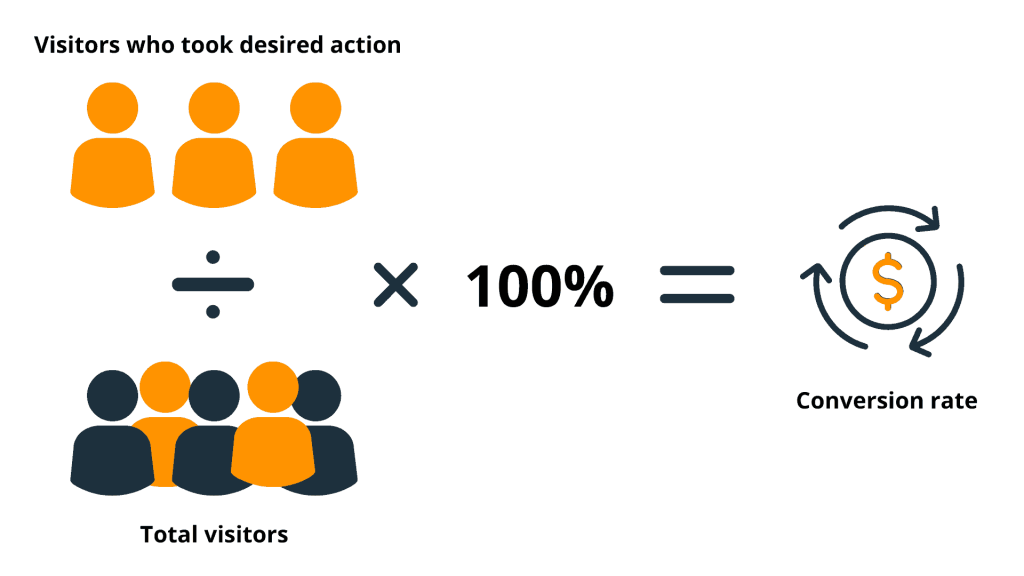
To measure your website conversion rate, divide the total number of conversions by the total number of visitors and multiply by 100.
For example, if you’re trying to increase the number of newsletter subscribers, then the actual number of subscribers you received during a specific time period (week, month, quarter, etc.) is your conversion that should be in the numerator.
Other formulas you can use to calculate the conversion rate are:
- Total number of conversions / total number of sessions multiplied by 100
- Total number of conversions / total number of leads multiplied by 100
The method you use to calculate your conversion rate ultimately depends on your desired conversion goal (newsletter subscribers, form submissions, and so on) and how you measure your website traffic.
How to increase your website conversion rate
Here are 7 effective and easy-to-implement ways for increasing your website conversation rate.
1. Include web forms on your website
2. Add customer testimonials to relevant web pages
3. Use a strong call to action on your landing pages
4. Include live chats on your site
5. Create content for every stage of the sales funnel
6. Improve website navigation
7. Analyze your website visitor data
1. Include web forms on your website
The general purpose of a web form is to capture various kinds of information.
When choosing an online form builder, there are a few things to keep in mind:
- How easy it is to build a form? A complex interface will make your job unnecessarily hard.
- What customization options are available? Can you set brand colors for your forms?
- How many submissions are allowed? Ideally, you need an unlimited number of submissions.
- Does the form builder integrate with your CRM or are all submissions recorded in a spreadsheet?
- How do these web forms look for mobile users?
- How do you share a web form? You need to have two options: either sharing a unique link to your online form or embedding the automatically generated HTML code to your website.
Below is an example of an optimized web form from Drone Views.
The web form is easy to understand and fill out, collects all relevant information, and uses brand colors. Besides, all submissions that are received through this online form are automatically added to the company’s CRM with a reminder assigned next to them.
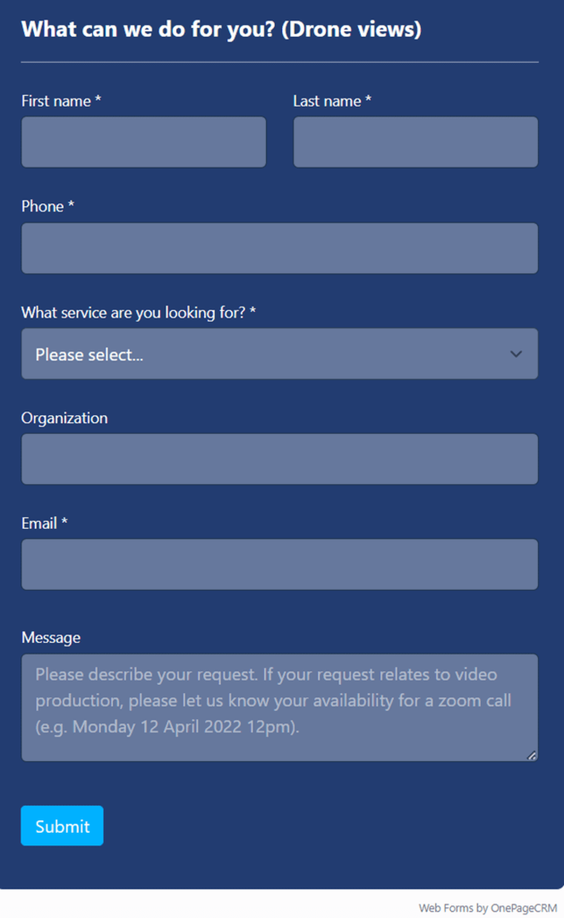
You can also use A/B testing with web forms to measure what format or placement is most effective on your website. For example, you can create variations of the same web form and see which one has a higher conversion rate. You can experiment with colors, questions, field types (drop-down lists vs. checklists), and so on.
2. Add customer testimonials to relevant web pages
Including customer testimonials on your website has a huge impact on conversion. According to one of the studies, when a website visitor interacts with a customer review, they are almost 60% more likely to convert.
By using testimonials, you let prospects know that others have been satisfied with your products and services and trust you—and they can count on you too.
Whether you are creating a service or a product, including testimonials and customer reviews is critical.
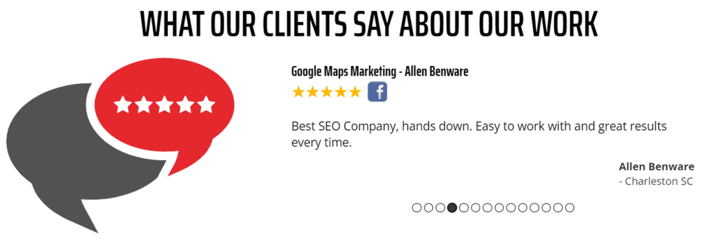
For example, Mr. Marketing, an SEO consulting firm, has a carousel of customer testimonials. You can see the customer’s name and whether the review was left on Google, Facebook, or any other platform—that boosts the authenticity of the testimonials and their effectiveness.
Here are a few tips on how to add testimonials to your website:
- Take inspiration from other companies to find a visual format that works for you.
- Ensure those testimonials feel authentic.
- Use testimonials from customers that mirror your target audience.
3. Use a strong call to action on your landing pages
A strong call to action (CTA) is crucial for boosting website conversions because it motivates visitors to perform the desired action. It could be a call to join an email list, supply certain information, take up an offer, or anything else.
To create a strong CTA, avoid the typical statements like “Sign Up Now,” “Order,” or “Start Trial”. These can easily be ignored by visitors. A CTA should be captivating.
Check out this example from OnePageCRM:
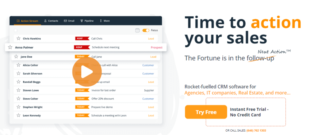
One look at the page and your eye is automatically directed towards the CTA “Try Free.”
That’s because of several reasons:
- The CTA color, bright orange, stands out on a white background.
- The words used as the CTA pique the interest of the viewer. When you say “Try Free,” you give people the assurance they don’t have to pay for anything if they try your product. Who doesn’t love a freebie?
Here’s another example from HelpScout:
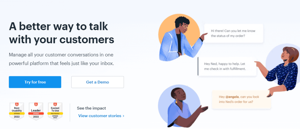
Notice that both CTAs, “Try for Free” and “Get a Demo,” stand out on the page because of their colors. HelpScout also uses more than one CTA option. So if visitors are not interested in trying their product for free, they’ll get the demo instead.
If you go this route, make sure that you don’t give your website visitor more than two alternatives. This holds true however your website looks. Whether you have a quirky retail website layout or a more serious industrial web design, bear in mind that if you give your visitors choice overload, they might end up leaving without taking any of your desired actions.
Don’t forget to test your CTA to find the phrase, color, and placement that bring the best results.
4. Include live chats on your site
Including live chats on your site is a good way of improving user experience and increasing your website conversion rate.
Through live chats, potential customers can receive instant help, which will, in turn, accelerate their conversion. Depending on how many resources your company has, you can also consider using chatbots.
There are many tips you can follow to make your live chats effective:
- Reduce response time. Your team should reply within 60 seconds. According to Econsultancy, 79% of customers say they prefer live chat because it provides instant responses.
- Use canned responses but only on a limited basis. Canned responses are predetermined and can help you save time and avoid spelling or grammatical issues. Use these types of responses sparingly, though. You don’t want to make your website visitors feel like they’re talking to a robot every time.
- Personalize conversations. You should address website visitors by name if possible, understand the visitor’s specific concern, and give relevant suggestions. If your website visitor asks for your product’s features, for instance, you shouldn’t give them pricing options.
- Be friendly. Make your website visitor feel comfortable. Use casual language and make visitors feel like they’re talking to a friend.
Check out this live chat example available on the OnePageCRM website.

Notice the friendly tone that puts the website visitor at ease from the get-go. The smiling faces of members of the OnePageCRM team above help, too. When website visitors see faces of people who appear to be willing and ready to help, they won’t hesitate to ask questions.
Also, your agents should be trained to provide enough answers to common customer pain points. If you’re looking for a good live chat tool for a small business, check out HelpScout or Olark.
5. Create content for every stage of the sales funnel
Most visitors will move through different stages till they are ready to buy your product. Therefore, you need to create content for each stage of the sales funnel to accompany them throughout their journey.
Here’s the type of content to create for each stage of the sales funnel:
The Awareness Stage is the start of the user’s journey. It’s the first stage of the sales funnel. During this stage, potential customers are looking for helpful information. So, you must include useful content such as social media posts, e-books, or blog posts.
But what is useful content?
Let’s say you’re selling email marketing software. Useful content in this case would be social media posts or e-books on email marketing. You want this type of content on your marketing platforms since it will attract people who are more likely to be interested in your product.
A blog post offering marketing tips for recruitment on your recruitment marketing website is another excellent example of content for the awareness stage.
If you want some ideas on topics to write about for the awareness stage, Google can help. Type in a keyword and press Enter. Then go to the People Also Ask section.
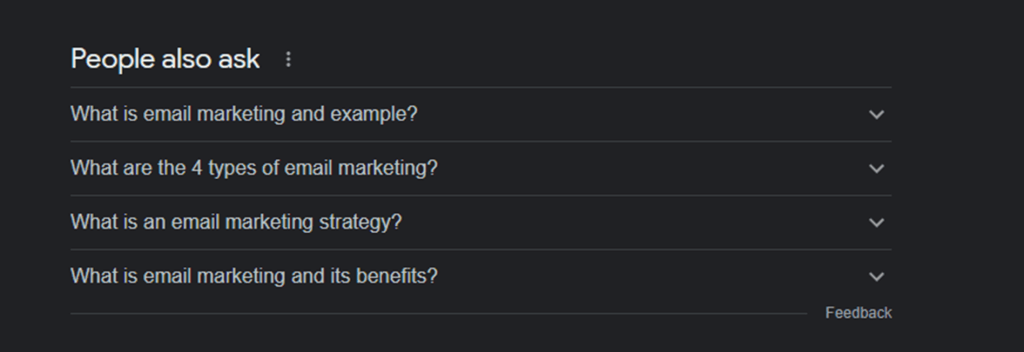
Check out the screenshot above for topics Google suggests when I type in the search term “email marketing.”
The consideration stage is where you try to convince ideal prospects that you meet their needs. During the consideration stage, the visitor considers multiple options before making a buying decision. Content such as peer reviews, guides and case studies will be fit for this stage. The content should work to convince the prospect to do business with you.
Quickbooks, for example, creates content comparing its solution to its competition. They also use reviews to show why they are the best options for prospective customers.
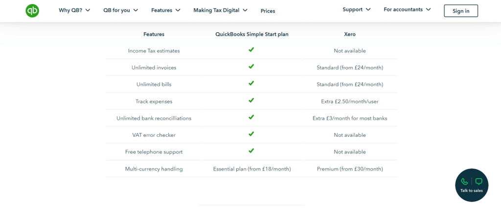
The decision stage should include content that offers the final nudge for sales conversion. The best content types for this stage include free trials, consultation offers, product literature, analyst reports and case studies. These will help influence leads into making a buying decision.
On OnePageCRM’s website, for instance, you’ll find case studies that show how the tool has helped other companies grow. This can be the final nudge website visitors need to try out or purchase the product.
6. Improve website navigation
The easier it is to navigate your site, the higher the chances of increasing your website conversion rate. Simplified navigation allows your visitors to move around your website without any difficulty and find what they are looking for.
You should evaluate your website’s navigation and check for certain factors:
- Does your website have clear categories?
- Does your drop-down menu have specific options that are kept to a minimum? In general, avoid drop-down menus that have more than 10 options. You don’t want to confuse your visitors with too many alternatives.
- Does your website follow a familiar structure? So if the majority of your website visitors read from left to right, arrange your categories from left to right, not from top to bottom.
- Does the search function, if you have one, work correctly?
Talkdesk is an example of a website that has an organized navigation structure. If you check out their blog, you can use filters to see blog posts only in a specific category.
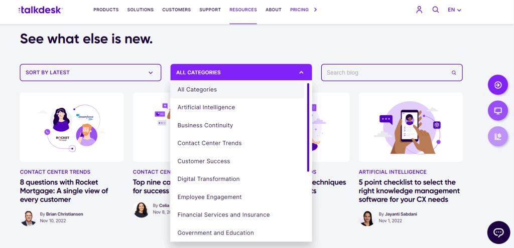
Talkdesk also includes a search function next to these categories. You can just type in the topic you’re researching on and you’ll get a list of content on the same topic.
By improving your website navigation, you can make it easier for prospects to move around your site, and they’ll stay longer on it. But, more importantly, they’ll find what they want, which, in turn, will lead to more sales.
7. Analyze your website visitor data
Analytics is an integral part of the conversion rate optimization process. Analyzing your visitor data gives you insightful information about your visitors, their behavior, and the conversion rate. This can help you craft more effective marketing strategies.
To analyze your website visitor data, you need tools such as Google Analytics. Here’s how to set up Google Analytics:
- Go to google.com/analytics.
- Click on Get Started Today.
- Fill out the necessary information.
- If you already have a Google Analytics account, just click on Sign in to Analytics.
There are several types of website visitor data you want to check. You need to monitor how visitors find your website, for instance. To do this, on Google Universal Analytics, do the following:
- Go to Acquisition.
- Click on Traffic.
- Press Channels.
You should get something like this:
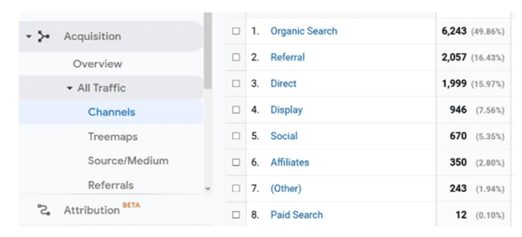
Why is this piece of information important? If you know your website traffic source, you can focus on the marketing platforms that work and disregard those that don’t. For instance, based on the report above, paid search only brings in 0.10% of the overall website traffic. You can decide then to just stop putting out ads in search engines and focus on SEO for organic traffic instead.
One more thing you want to look at are page views. On Google Universal Analytics, just navigate to Audience, and then to Behavior. Click on Overview report:
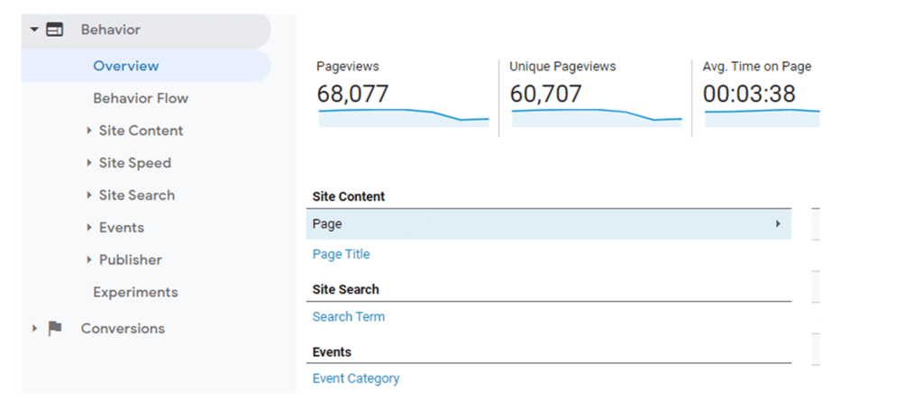
Knowing your page views helps you determine your website’s overall performance. In general, an average of 1,000 page views per month is good. Check out the average time on page too. It tells you whether or not your page has a good user experience. According to Klipfolio, a good average time on page is 52 seconds.
If you get anything less than 52 seconds that means you need to improve your website navigation. So, you might want to check your CTAs. Are they easily understandable? Look at the page architecture, too. Is it logical?
A/B testing your page can help. It involves creating two different variations of the same page, running them, and seeing which one yields the best conversion results.
Improving Your Website Conversion Rate
Your website’s conversion rate is critical to your business. Your ultimate goal is not just to get people to your site. You want them to take your desired action too.
The good news is, there are many ways you can increase your chances of converting your website visitors. All you need to do is follow the tips in this article. Then monitor your conversion rate after optimization. If the rate doesn’t increase, make changes to your pages again.
Ultimately, you just want to see where your data takes you. With the proper monitoring and adjustments, you’ll see your website conversions soaring in no time.

About blog post author
Ian Loew is a web entrepreneur and inbound marketing expert, and the Owner & Head of Business Development of Lform Design. After four years of helping Fortune 500 companies with MGT Design, Ian embarked on his freelance career before establishing Lform Design in 2005.

