Are we a match? Are we a match

The Story Behind One Brand and Its UX

Table of contents

I’m not sure whether to say our brand influenced our unique User Experience or the other way around. What I do know is that they are like twins.

When we started this business, this app, we put one solid stake in the ground – our “product mission” – to be as easy to use as email and to approach zero admin. Simple enough. Simple, but powerful.

Our product mission precedes any other mission within the business, bar a close second of having world-class customer service – one that’s influenced by Tony Hsieh, Seth Godin et. al. (but that’s for another day, another blog post). Today, I want to talk about our ultimate core, our UX, our brand, and their meaning.

To be as easy to use as email

To be as easy to use as email” – how would you reach that goal?

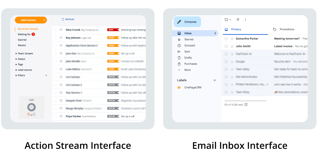
Well, we started by allowing our app to look and feel like an email client – possibly the most widely used application in the world. This was very important because we were breaking the rules of what a CRM was, so we needed to ensure our software felt familiar in some other way.

We didn’t break the rules for the sake of it – as a teenager needs to do to strike their own identity in the world. We broke the rules because we wanted to make an effective and useful application. In reality, our app’s DNA comes from mixing the familiar interface of an email client with the Twitter-like stream of 140 characters that float to the top with the all-important Next Action for each client.
It turned out to be more powerful than we expected. DNA that was honed from the need for utter focus on taking action – and not the cop-outs for procrastination, sloppiness, or misfocus.
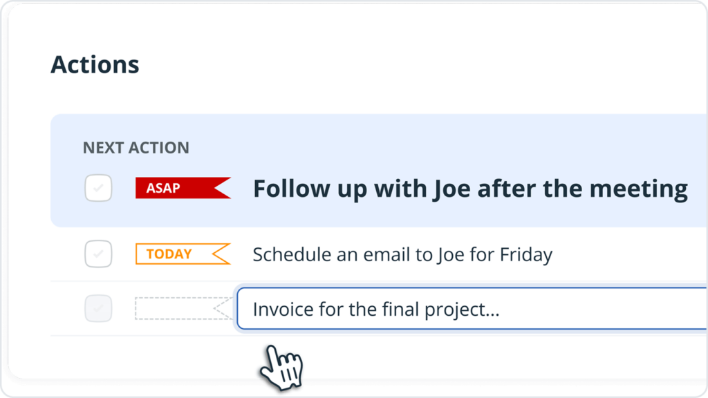
The world’s email clients have not changed much in concept over the decades. Yes, they got slicker, quicker, and more intelligent (swipes, snoozes, and social filters), but the core concept is still the same. There’s a flow or list of emails that appear on the screen, and you click on emails to read them. The essence of a one-page application.

And that’s where the OnePage name came from.

We went down this route as far as we could, as far as it made sense in the context of our CRM. Notably, we kept all the filters on the left. We pushed for just one “Add button” in the interface, (in our case “Add Contact” – a mirror of your email client’s “Compose” button).

And finally, what has proven to be hard work over the years to keep true, we kept all the related data on the contact, its organization, and its actions, deals, notes, etc., available in one click, in one easy scrollable view.

The technical difficulty with keeping this concept intact has always been solving the issues coming from many dependencies existing in a large business application.

An scéal eile. [Irish/Gaelic for “another story”].

The meaning of a brand

The general mistake some people make is thinking of a brand as a logo, a name, or a color. In most cases, a brand is only what exists in the prospect’s (the observer’s) mind. You can’t control what is in their mind, but you can do your darndest to influence it.

For us, the brand we try to create stands for honesty, support, and caring, especially in a world (of software) that too often puts these values on the verge. And from what we can feel we’re doing a pretty good job – feedback suggests we go above and beyond in our customer service.

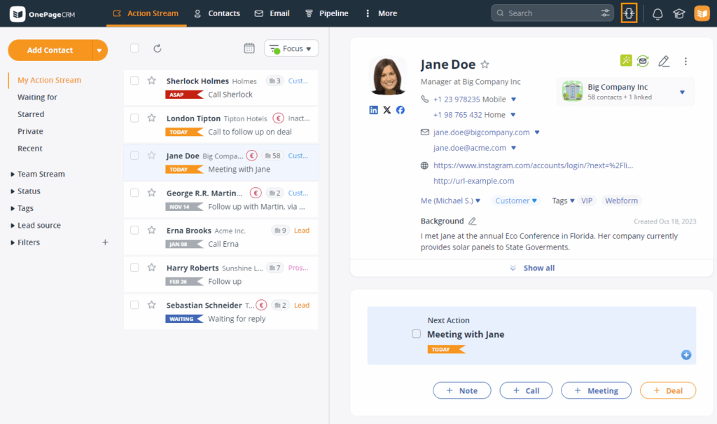
The visual part of the brand is a literal reflection of our interface. On the left-hand side, it mirrors a typical email list, specifically in an email client with the split pane turned on – that’s our Action Stream.

split pane view

The split-Pane: A confession

The split-pane view of email is the preferred UX of a large percentage of the email world, made famous by Microsoft’s efforts in Outlook. It was also adopted but not pushed by Gmail. Device makers like Apple and others have also made it the de facto view in tablets. So it’s a well and truly alive concept – click on the left, read on the right.

And so now I NEED TO MAKE A CONFESSION.

A confession to those who have only ever seen and used OnePageCRM in a page-centered single-column view. The truth is a split-pane view has existed all along but it has never been exposed to you.

In 2014 we made the decision to add a single-column view, to be better suited to the pending onslaught of tablet and mobile. It turned out pretty good, and we decided to introduce it to new sign-ups by making it the only option.

Our long-term vision was to consolidate and move all users to this single (and what we saw as focused) concept.

But they never moved!

We have a large cohort of loyal customers using a split-pane view for a long time now. And their loyalty to us could not be ignored, so over the years, we have catered for two versions of front-end code. Legacy users, as they are called in this industry. Legendary users, as we like to call them.

If you can’t beat them, join them

As they say, you should eat your own dog food – we have always used OnePageCRM to sell OnePageCRM. So the first customer we need to please is ourselves. We managed to move our internal staff to the modernized single column without the Split pane.

Change, as we know, is always scary. The unknown is, well, unknown. Some resistance came, but I invited them to “try it for two weeks and see how you get on.” They never looked back.

I didn’t force our die-hard legendary users to do the same, thinking that over time they’ll see the “better” interface. But, alas, they didn’t.

Why?

I asked, and what I found out was this. OnePageCRM in its split-pane guise was the only piece of software on the planet to “beat Excel at lead qualification.”

This was interesting, very interesting – accidentally becoming #1 in the world for something. So what to do now? On one hand, we were following a new route of ultra focus. But were we leaving behind a very strong aspect of our software?

We also learned this view was perfect not just for Lead Qualification but for any type of business process that had a “light touch with many customers” approach, as opposed to deep or complex sales. In lead qualification, it’s a matter of making a decision and moving on quickly. In some businesses you might need to kiss 100 frogs before one becomes a prince, so time is of the essence.

So we started work on merging the divergent front-ends and giving the user a choice, a smart choice, to change quickly between interfaces. Just like users can do in email clients. We were going back to our brand’s DNA.

Split Pane for all

Today, I’m pleased to announce the release of split pane to all our users. It has been a difficult UX puzzle to solve and a product decision to make. When you change a core aspect of your interface that may or may not disturb your flow, your thinking, your process, you take time to access and iterate, test it on your own team and see if it works long-term.

We’ve put our best foot forward, and I hope you like it. Some of you may never use split pane, some may want to move to it permanently. And some, like me, will say “it depends”. Depends on my mood, on what I’m doing at that time.

Am I in a light-touch sales process? I remember using the split pane for my CEO Tour of the UK last year, when I got my team to shortlist a few hundred of our users in the UK to visit on the tour. I wanted a mix of big and small (companies), simple and complex (sales), and diverse and mainstream (OnePageCRM app configurations).

Split pane gave me that speed and ease to make decisions from “browsing customers”. No other sales application allows you to BROWSE CUSTOMERS like our split pane does.

We hope you like it!

Thank you all, our long-time split-pane (2-column) users and our new cohort who may have a new friend from today. Thank you for being our customer.

Comments (6)
  1. Split pane is really useful. Maybe you should open up other hidden functionality and let the user decide how they want to use it. I’d really like the option add some colour to differentiate between calls and other activities on the action stream. Having this at a glance colour feature would be very useful especially when you have a very busy day, time is running short and you have to choose what to omit.

    1. Thanks for your feedback Stephen, we don’t have any other hidden features, this one was in the woodwork for some time. However I’m pleased to let you know we do have some great beta features – Focused User and email sync and coming soon is multi-pipelines. Drop us an email if you’d like to join.

      Thanks for your suggestion on colour coding in Activity, I’ll be sure to pass it over to our Dev team. I agree, the days can sometimes fly by!

      Keep in touch!
      Carmel

Leave a Reply

Your email address will not be published. Required fields are marked *

Left

The CRM you’ve been looking for

Try Free
No credit card required • 21-day free trial
Right
close